Posted by: Online Marketing Blog – TopRank®
Posted on: 7/22/2019
We’ve all been there. We’re five minutes into (what we thought would be) a riveting, data-driven presentation, yet a quick scan of the room reveals the audience is staring blankly at our data tables as we drone on. Or worse, someone asks a pointed question about what they do or don’t see and the discussion goes completely of course. Yikes.
Perhaps the best advice I ever received in this regard was so simple yet incredibly smart: “Try it as a line graph.”
I had presented a data-backed presentation and robust recommended next steps, but whether it was boredom or data suspicion that crept in, I failed to make my case. After the weeks I spent looking at a spreadsheet, I took that visionary advice. When the day came to remake my case, that line graph immediately won my critics over.
When done thoughtfully, data visualizations have the power to change perspectives, far more quickly than a spreadsheet or bullet points on a slide. Data visualization allows us to take complex or even simple data sets, and present them in a way that allows us to see context, make comparisons, and enable decision-making.
The good news? Giving your data a visual identity is easier than you think.
The Case for Data Visualization
This is going to sound cliché, but we marketers really do have more data at our fingertips than ever before. And visualization is key in order for us to really leverage that data to tell a story and win over our bosses, colleagues, and customers. Here’s a simple example. First, the spreadsheet version: What can you take away from this example in just 5 seconds? 10 seconds? 30 seconds? July 2018 and December 2017 seemed to be big months. There was definitely some growth in the last two years. But how much? Is it consistent? How are we trending? Now, let’s look at this data as a line graph: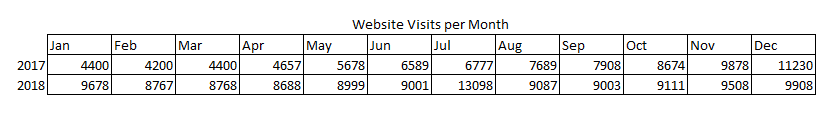 Whoa! 2018 outperformed 2017 by quite a bit overall. However, 2017 traffic was on the up and up, and that momentum slowed in 2018. With the exception of a mid-year spike, 2018 traffic was flat, and dipped below year-over-year totals by the end of the year.
 The beauty here? As we prepare to deliver the data to our audience, we can draw some pretty important conclusions at a glance, helping us quickly arrive at what we need to find out next: What caused that big spike in July 2018? Is it an outlier or did we have an effective campaign running? What did the tactical mix look like throughout 2017? What were the top pages contributing to steady growth? Did we make major changes at the beginning of 2018?
This not only helps us dig deeper into our data to understand trends and opportunities, but also prepare us to craft a narrative and answer the questions our bosses, colleagues, or clients will undoubtedly have about performance. After all, flashing a spreadsheet and then telling someone traffic is up year-over-year overall but flat month-over-month for the current year is not going to deliver much wow.
The beauty here? As we prepare to deliver the data to our audience, we can draw some pretty important conclusions at a glance, helping us quickly arrive at what we need to find out next: What caused that big spike in July 2018? Is it an outlier or did we have an effective campaign running? What did the tactical mix look like throughout 2017? What were the top pages contributing to steady growth? Did we make major changes at the beginning of 2018?
This not only helps us dig deeper into our data to understand trends and opportunities, but also prepare us to craft a narrative and answer the questions our bosses, colleagues, or clients will undoubtedly have about performance. After all, flashing a spreadsheet and then telling someone traffic is up year-over-year overall but flat month-over-month for the current year is not going to deliver much wow.
How to Get the Storytelling Started with Data Visualization
Creating a narrative, choosing your data set, perfecting your visualization, and adding context are essential for being able to persuade any sort of action or reaction with data. But whether you are using a simple Excel graph or a custom data visualization tool, here are some great tips to get started.Tip #1 - Start with your story and frame it for your audience.
Let’s say you’re presenting the results of your most recent marketing campaign to your internal stakeholders. It can be tempting to throw up any data point you can get your hands on, trying to see what sticks. Don’t do that. Your boss probably doesn’t care about how many shares you got on that one blog post or how many seconds someone spent on a video. They care about new prospects, re-engaged prospects, or advocacy.- Stay laser focused on your objective: What are you trying to achieve with this presentation? A bigger budget? A promotion? A shift in tactics internally? Every data visualization included should tell that story. Too many data points can muddy the narrative and reduce your impact.
- Use your audience’s lens: Focus on the data you know is most important to your audience. Think of previous presentations you’ve done with them. Was there a particular data visualization they loved or one they pushed back on? Edit accordingly. If it’s your first time presenting to this audience, then use what you know based on job titles or culture in your office.
Tip #2 - Design for comprehension.
Data visualization is so awesome because it’s able to allow humans to quickly make comparisons and decisions quickly, even with a complex data set. So create charts with comprehension in mind. If your audience is staring at a graph trying to figure out what it means, they’re probably not listening to your supporting narrative. So make it easy for them to understand. Here are a few things to keep in mind: Label Everything: This seems straight forward, but nothing is worse than when someone pauses you mid sentence to ask you to clarify your data set. So, label your chart, axes, legend, and so on. Also include a note on time frame and data source. Make sure all labels are visible and not obstructed by other text. Chart Type: Choose the chart type that most efficiently illustrates your point:- Bar charts are best for comparing discrete values.
- Line charts are intended for a continuous data set.
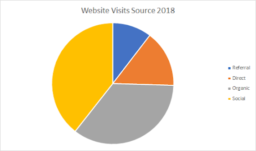
- Pie charts show the element something else is made up of, and are not ideal for comparing values.
- Stacked bar charts are best to compare different items and show the composition.
 Color: Incorporating color to help tell your story can be very powerful, but can also lend confusion. A few practical things to consider:
- Don’t choose colors that are low contrast. Consider the fact that you may be presenting on a different monitor and the audience will be further away from the screen.
- Use the same color to represent data from the same grouping or data set (e.g. all points from 2018 are in green and 2019 in yellow.)
- Be careful about using colors that have significant meaning on their own (e.g. bright red is always going to set off an alarm bell, whereas green tends to indicate something is good.)
- Use accent colors to highlight really key data points. This can draw your audience’s eye immediately and increase comprehension.
- Add call-outs to your slides so you can help your audience understand a data set really quickly (e.g. Sales reached an all time high in June 2019).
- Keep your data ordering intuitive such as ordering by value, time period, or alphabetically.
Tip #3 - Create for context.
We should always anticipate, any presentation we create, can and will be passed along for others to consume, without the benefit of our verbal narrative. So, it’s important that your data visualizations have enough context so the impact can be understood with or without verbal support. What do we mean by context? Here are a few things to keep in mind:- Is this good or bad? What would you expect? This is definitely a frequently asked question from marketers as we are evaluating campaign or channel performance. One of the most important contextual markers you can add to a performance slide is a benchmark from previous data or third-party industry data.
- Why? Data visualization can help us understand the current situation, but they can also help us answer the “why” behind a data set. Context in this situation can reveal hidden insights, which can really change the minds of our audience. For example, let’s say you are charting MQLs over time, now plot that against another variables which may drive fluctuations in MQLs, like website traffic, paid investment or frequency of events. This might help you determine whether overall web traffic is irrelevant, but paid investments are critical.
- What should we do next? Now that we understand the context for our data and what is driving it, the next question is what should we do next? Always include next steps related to your data visualization.
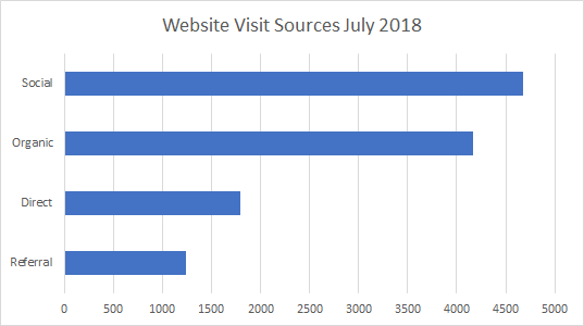
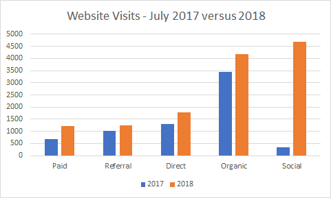 Finally, looking at the same data as in our previous visualizations. This example dives into July 2018, with the added context of 2017. In this graph, we can easily see a spike in social caused our July 2018 increase. Now, we can add a call out to shout out to testing a paid social campaign or a contest that was running at that time.
Tip #4: Be careful not to mislead your audience.
Data can be really powerful, if used wisely. But if we don’t understand or interpret it properly, it can also drive bad decision making. So as a presenter, definitely do these things to keep your data representation free of misleading information:- Start your key at zero (and keep it consistent): It can be tempting to make that 3% increase look like 50%, but don’t change your scale unless it’s really pertinent to the data set, and then call it out.
- Understand your data: If you (or your team) is pulling data from a tool like Google Analytics or Hubspot, be sure you understand the nuance or context of your data points (e.g. what’s included in that site conversion rate, how you’re categorizing a new user, what is the criteria for SQL versus MQL.)
- Include context: Be careful not to omit the context or drivers of the data set you’re aware of, even if they don't necessarily fit your narrative. For example, if you had a great Q3 for leads, but the first half of the year was down, don’t omit that context, just to make Q3 appear better. That context will probably change your tactical mix, investment levels, and next steps.
Show Don’t Tell
To be really effective marketers, we must review and analyze data in order to make our own decisions about a tweak in tactics or a strategy overhaul. Our ability to illustrate to our colleagues, bosses, and customers how data insights inform our decisions ultimately impacts our ability to move forward with our plans. So practice! Find that colleague who can review your latest graph and see what their first takeaway is. Do your presentation with a smaller group before you bring to your boss. See what they respond well to or question, and edit accordingly. Data is power. Data visualization is powerful. [bctt tweet="Data is power. Data visualization is powerful. @Alexis5484 #datavisualization #marketing" username="toprank"] Many marketers aren’t using the data they have to its full potential. Set yourself on a path to better data and analytics utilization with these tips for overcoming common barriers.The post How to Power Marketing Presentations With Data Visualization & Win Over Your Audience appeared first on Online Marketing Blog - TopRank®.
BACK TO ISSUE